Georgia O'Keeffe: The Sensory Alchemy of Colour and Craft
Georgia O'Keeffe’s name is almost synonymous with vivid, commanding depictions of flowers, desert landscapes, and abstracted forms. Yet, to focus solely on the subject matter of her paintings is to miss something deeper: her unparalleled ability to make colour come alive on the canvas. O'Keeffe’s works are not just visually striking, they are multi-sensory experiences. Through colour, texture, and the physicality of paint, she transported viewers into a world where sight met sensation, creating an intimate language of pigment, touch, and atmosphere.
O’Keeffe once recalled an early childhood memory that would become central to her understanding of art: “The colour of the dust was bright in the sunlight. It looked so soft I wanted to get down into it quickly.” This tactile desire for colour—wanting to "eat" the dust because of its texture and hue—is foundational to understanding how O'Keeffe approached her work. For O'Keeffe, colour was never just something to look at; it was something to feel, something to inhabit.
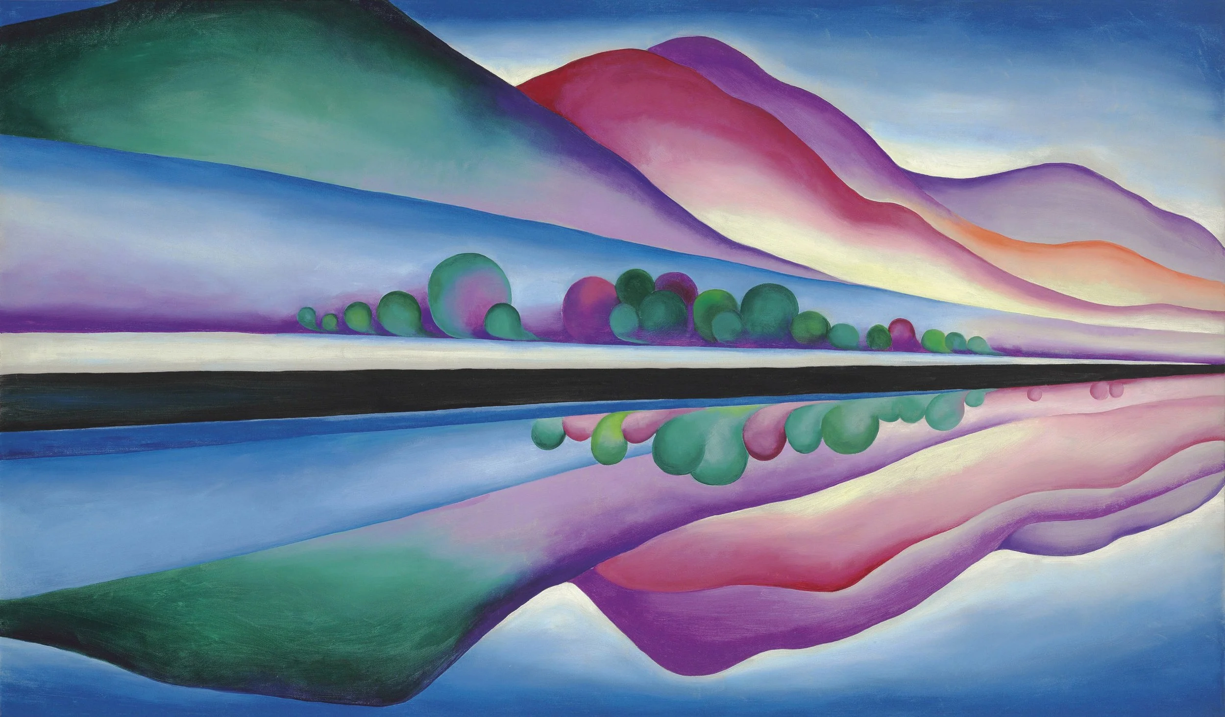
"Lake George Reflection" by Georgia O'Keeffe
Image Credit: Wikimedia Commons
Her connection to colour was deeply embodied. She didn’t merely observe the world—she lived in it, translating her sensory experiences into visual form. O'Keeffe’s canvases pulse with a tactile presence; each stroke of colour seems to vibrate with energy. In her iconic works like Red Canna (1924), Black Iris III (1926), Pelvis with the Distance (1943), and Sky Above Clouds IV (1965), the colours feel almost tangible, inviting the viewer not just to see them but to experience their texture, their weight, their rhythm.
Crafting Colour: A Methodical, Scientific Pursuit
O'Keeffe’s deep engagement with colour extended far beyond mere intuition, it was a calculated, methodical pursuit of perfection. In her New Mexico studio, she created over 330 colour cards; small, carefully labeled rectangles of canvas painted with pigments mixed precisely to her specifications. These cards were not mere practice pieces; they were the result of years of experimentation with different binders, resins, and solvents. O’Keeffe knew exactly how each pigment would behave, how it would interact with light, and how it would stand the test of time.
Her scientific approach to colour wasn’t just about control, it was about freedom. By mastering the materials at her disposal, O’Keeffe was able to push the boundaries of what colour could do on the canvas. She would test different combinations, layering hues and manipulating textures until they yielded the precise visual and emotional effects she sought. The results speak for themselves. Her paintings feel alive, changing in the light, breathing with the atmosphere she created.
O'Keeffe often said, “If one could only reproduce nature, and always with less beauty than the original, why paint at all?” This mindset underscores her belief that colour was not just a tool for representation—it was a language of its own, capable of evoking emotion, atmosphere, and a sense of place. Her works like Red Canna (1924), where vibrant reds and oranges swirl in harmony, challenge the notion that colour must adhere to the natural world. Instead, O’Keeffe used colour to evoke a world of sensation, where the line between the seen and the felt blurred.
In her famous flower series, O'Keeffe imbued even the simplest bloom with emotional depth. What might seem like a straightforward depiction of a flower is, in fact, a complex exploration of colour relationships—of contrasting hues that make the white of a petal whiter and the green of a leaf greener. The colours vibrate and hum together, creating a heightened emotional experience that transcends mere representation. For O’Keeffe, colour was a means of making her paintings sing to make the viewer feel something profound in the way light and pigment interacted.
Black Iris III (1926) exemplifies O'Keeffe’s ability to combine deep purples and blacks with touches of white, creating a sense of movement and depth. The colour contrasts suggest an emotional resonance far beyond the simple depiction of a flower, almost as if the iris were a living, breathing entity. The painting pulses with the same sensuality that O’Keeffe saw in nature, its swirls of colour invoking the mystery and energy of the natural world.
O'Keeffe’s colour mastery wasn’t born overnight. She spent countless hours perfecting her process. Her palette was always meticulously prepared, with her brushes and tools carefully arranged. In her later years, even as her eyesight deteriorated, she continued to rely on her instinctive knowledge of colour and the tactile process of painting. According to one of her assistants, John D. Poling, O’Keeffe painted with “a deft and light touch,” gently pushing the paint into the canvas, as though coaxing the pigments to reveal their full potential.
This devotion to the process of painting itself—its materials, its textures, its rituals—is part of what makes O’Keeffe’s work so unique. She approached her art not as an intellectual exercise but as a deeply embodied, sensory experience. From the texture of the paint to the interaction of colours, every detail was considered, not just for its visual appeal but for its emotional resonance.
Her iconic Pelvis with the Distance (1943), where the starkly contrasting colours of the bone structure and the landscape converge, is a prime example of this intimate relationship between form and colour. O’Keeffe’s use of organic shapes, contrasted with flat planes of colour, creates a powerful rhythm on the canvas, suggesting an emotional depth beyond the physical subject matter.
O'Keeffe’s exploration of colour as a living, breathing entity redefined how we think about colour in art. She proved that colour could do more than depict reality, it could transform reality. By treating colour not as a passive element but as an active, dynamic force, she created a body of work that invites us to experience the world in a new way. Her paintings don’t just show us nature, they immerse us in it, allowing us to feel the desert winds, the smooth curve of a flower petal, or the softness of a distant sky.
In Sky Above Clouds IV (1965), the large, abstract swaths of colour invite the viewer into a boundless sky, an unearthly space that evokes a sense of transcendence and freedom. It’s a powerful example of how O’Keeffe continued to evolve, using colour as a medium for the expression of expansive, almost spiritual, experiences.
In O’Keeffe’s hands, colour wasn’t just a visual tool. It was a language of sensation, a bridge between the eye and the body, a way of communicating something deeper than words. It is this deep connection to colour, texture, and process that makes O’Keeffe’s work timeless and profoundly sensory.
Sources
Robinson, Roxana. ‘Georgia O' Keefe: A Life’, 1991
Doerner, Max. ‘The Materials of the Artist and Their Use in Painting’, 1949.
Vendelin, Carmen, curator. Georgia O'Keeffe: Line, Color, Composition. Georgia O'Keeffe Museum, 2021. Georgia O'Keeffe Museum Publications.
Images
https://commons.wikimedia.org/wiki/File:Georgia_O%27Keeffe_-_Lake_George_Reflection.jpg