Making An Impression: New 19th Century Practice And The Impressionist’s Palette
None embraced the innovations of the industrial revolution quite like the impressionists. As a primarily mid-late 19th century art movement, impressionism was one of the first to be able to utilise the mass production of synthetic pigments and the collapsible metal tubes they were sold in. And a style defined by loose brushstrokes and en plein air painting required an expanded modern palette. In the words of Pierre-Auguste Renoir, a renowned impressionist painter, “without paint in tubes there would have been no Cézanne, no Monet, no Sisley or Pissarro, nothing of what the journalists were later to call Impressionism.”
The metal tubes referenced, first commercialised by Winsor & Newton, effectively made the paints conveniently portable. Where before artists could only move their paints in animal bladders that could be pierced to squeeze out the contents, they now had sleek resealable tubes, making them easy to transport. All they had to do was take their paints, brushes and a canvas to a secondary location, leading to the craze of painting en plein air (outside).
Painting outside meant that the impressionists were exposed to entirely different lighting than in a studio. Everything was brighter, more vibrant, and in response the artists developed a common palette amongst them. the opaque: emerald green, vermillion, and types of yellow; and the transparent: ultramarine, viridian green, and red lakes. The different properties of the pigments could be used to create distinctions in work; the sky was often defined by opaque pigments with soft handling of brushstrokes, while reflections in water were often created with transparent glazes over a base. Large brushstrokes also accommodated the ability to change their direction to distinguish figures from backgrounds.
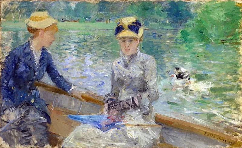
Morisot’s Summer’s day, 1879 is visually quintessentially impressionist with its handling of the paint and en plein air execution. Although not an entirely traditional display of impressionist pigments, seen in the use of ivory black, it gives a general idea of the pigments used at the time.
Morisot's Summer's Day, 1879
Image Credit: ColourLex
To the left of the main figure sits a woman leaning over the side of the boat in a striking blue jacket, contrasting the orange tones of her face and hair. The jacket itself is mainly rendered in cerulean blue, cobalt blue, and artificial ultramarine. All three of these blues were first introduced to the market in the 19th century, displaying the innovation of the time. Cobalt blue was derived from cobalt and aluminium and entered commercial production in 1807 after being discovered by Louis Jacques Thenard. Following close behind, cerulean blue combined cobalt and tin oxides in its first formulation early in the century, but was not used as an artist’s pigment until 1860. And finally, artificial ultramarine was synthesised in 1828 as a cheaper alternative to original ultramarine.
Left to right – Cobalt Blue, Cerulean Blue, Artificial Ultramarine
The greens that take the majority of the background consist mainly of emerald green and viridian green. The former, Emerald green, was first commercially produced by Russ and Sattler in the year 1814. Derived from copper (II) acetate and sodium arsenite, the pigment was toxic due to its arsenic content and thus is the reason it is no longer used today. Darker and bluer than emerald, viridian green was first formulated in an extensive process by the colour maker Pannetier in the 1830s. Unfortunately, the process made the pigment so expensive that it was not commercially viable until painter Adrien Guignet came up with a cheaper method, making the pigment commonly available in the 1860s.
Left to right – Emerald green, viridian
In satisfying contrast, combined with these new pigments were some that had formulae dating back millennia. Yellow ochre predominantly used in the boat, ivory black used to darken shades, and lead white to lighten or act as a base for transparent pigments have all been in use since prehistoric times. This combination of ancient formulae working alongside brand-new practices (for the time) adds a somewhat poetic sense to the piece, showing that innovation can coexist with tradition.
Impressionism as a movement was innovative and different, subverting the expectations of tight, highly detailed representation set by neoclassicism and romanticism. Yet it was still painting, a tradition dating back to the prehistoric. Therefore, it seems rather fitting that its values are reflected in the very pigments it uses. Innovation in new synthetic pigments and metal tubes, accompanied by tradition in the prehistoric pigments.
Sources
(2007). Cerulean blue. In: Gooch, J.W. (eds) Encyclopedic Dictionary of Polymers. Springer, New York, NY. https://doi-org.eux.idm.oclc.org/10.1007/978-0-387-30160-0_2129
Callen, Anthea. "Chapter Eleven: The Colour of Modernity." In The Art of Impressionism: Painting Technique and the Making of Modernity, by Anthea Callen. New Haven: Yale University Press, 2000. Accessed September 8, 2024. https://aaeportal-com.eux.idm.oclc.org/?id=-16650#A-16650_63.
Bomford D, Kirby J, Leighton, J., Roy A. Art in the Making: Impressionism. National Gallery Publications, London, 1990, pp. 176-181.
Roy, Ashok. “The Palettes of Three Impressionist Paintings.” National Gallery Technical Bulletin 9 (1985): 12–20. http://www.jstor.org/stable/42616026.
Images via ColourLex


